The film treatment for "Back in the Boat" replicates the style of a 90's football magazine with a vintage aesthetic. It features a bright, bold colour palette of green, yellow, and orange, and classic 90's fonts with thick, block letters. The treatment takes the form of a mock football magazine cover with an eye-catching headline and graphics.
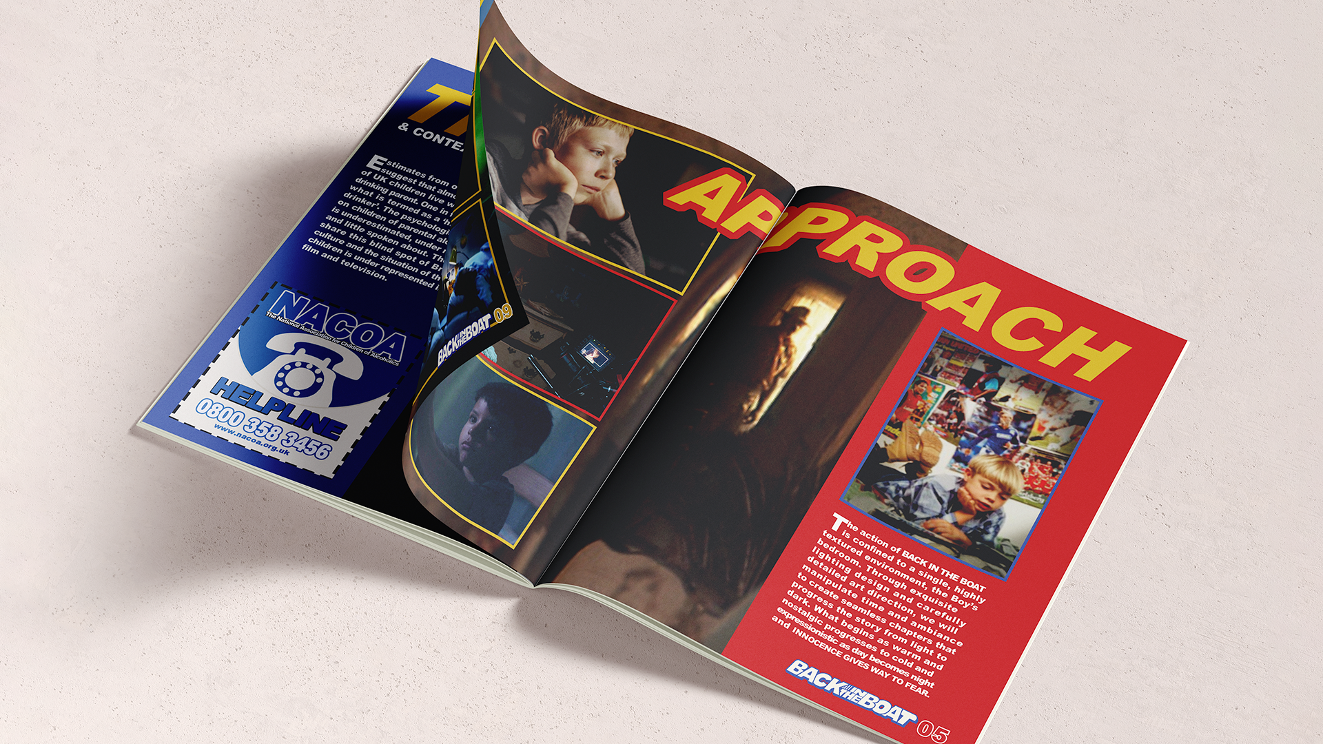
The challenge of designing the film treatment was to create a visually striking concept that accurately represented the film's style and tone. The sensitive themes of abuse and alcoholism in the film added another layer of complexity to the project. We had to ensure that the design elements conveyed the seriousness of the themes while maintaining the visual identity of a 90's football magazine. Throughout the project we were mindful that the treatment could potentially trigger sensitive emotions for viewers so we needed to ensure that the design elements did not trivialise the gravity of the themes presented in the film. As such, we incorporated typography that was bold and powerful, but not overpowering, and images which were suggestive but not graphic.
The final film treatment effectively captured the themes of the film while being visually compelling and authentic to its references.